
Have you ever visited a website on your phone and had to zoom in to read something or scroll? That site probably wasn’t responsive. These days, that’s something many users won’t forgive.
In this article, I’ll explain exactly what responsive web design is, why it’s become so important, and how it can benefit both your visitors and the overall performance of your site.

Responsive design is no longer an option; it’s a necessity. Ensuring your site looks good and functions correctly on all devices not only improves the visitor experience but also directly impacts your search engine ranking, reputation, and conversions.
What is responsive web design?
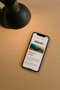
Responsive web design is a design and development technique that allows a website to automatically adapt to the screen size of the device it is accessed from.
This includes desktop computers, laptops, tablets, and, of course, smartphones.
Instead of creating a different version of the site for each type of device, a responsive design rearranges and resizes visual elements so that everything looks good and is functional on any screen size.
Why is responsive design so important today?:
1. Mobile traffic dominates
Over 60% of global web traffic comes from mobile devices. If your site doesn’t look good on a phone, you’re losing visits, leads, and credibility.
2. Improve the user experience (UX)
A responsive website is easy to navigate, fast, and readable on any device. This translates into a positive user experience, reducing bounce rates and increasing time spent on the page.
3. Improve your Google ranking (SEO)
Google prioritizes websites that offer a good mobile experience. Since 2018, Google’s index has primarily used the mobile version of content to rank sites. If your site isn’t responsive, you could be losing ground in search results.
4. Save time and resources
Instead of creating and maintaining two separate versions of your site (one for desktop and one for mobile), a responsive design allows you to manage everything from a single location. This reduces development and maintenance costs.
5. It adapts to any current and future device
With the constant emergence of new devices (smartwatches, foldable tablets, smart TVs, etc.), a flexible design ensures your site is ready for whatever comes next.
How to tell if your website is responsive?
You can do a quick test by opening your site on different devices or simply resizing your browser window on your computer. If the elements fit without breaking or going out of bounds, that’s a good sign.
You can also use tools like Google Mobile-Friendly Test to get a technical evaluation.
Keys to good responsive design
- Flexible design with grids and percentages.
- Responsive images that scale without losing quality.
- Using CSS media queries to apply styles based on screen width.
- Buttons and links easily accessible on touchscreens.
- Fast charging and mobile performance optimization.